
Émile Ferrand
Email design, back in stock · Grasse
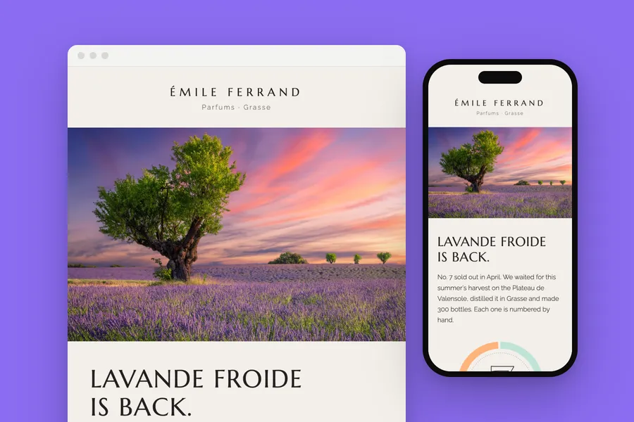
A back in stock email for a perfume house: a dial of the notes around an outlined No. 7, and the day subscribers get first.
The brief
Tell the waiting list a sold out edition is back, and give them the first day.
What we designed
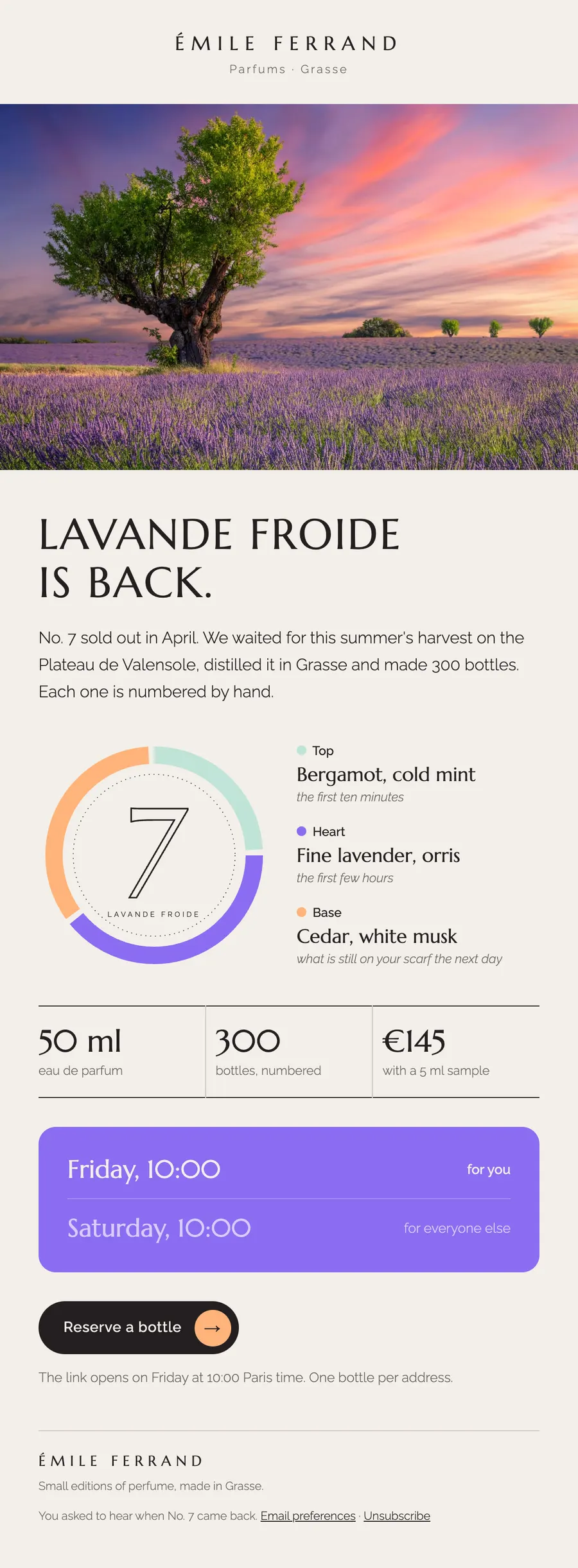
After the lavender field, a ring in three colours shows the top, heart and base notes, with the edition number drawn in outline at its centre.
The facts sit in one ruled row, and a violet card says who can buy when.
How it is built
- The notes are written out beside the dial, so nothing depends on the picture
- 600 px wide, built in tables with inline styles
- A phone layout that stacks below 600 px
- The brand's fonts, with web safe fallbacks for clients that block them
- Images at twice their size for sharp screens, alt text on every one
- Preheader, preferences and unsubscribe in place
Typefaces: Marcellus, Raleway. Palette: Ivory #f3efe9, Violet #8b6cf1, Mint #bfe3d6, Apricot #ffb37a.
Next project: Dolomite Days · All work