
Lund Ceramics
Email design, shipping · Copenhagen
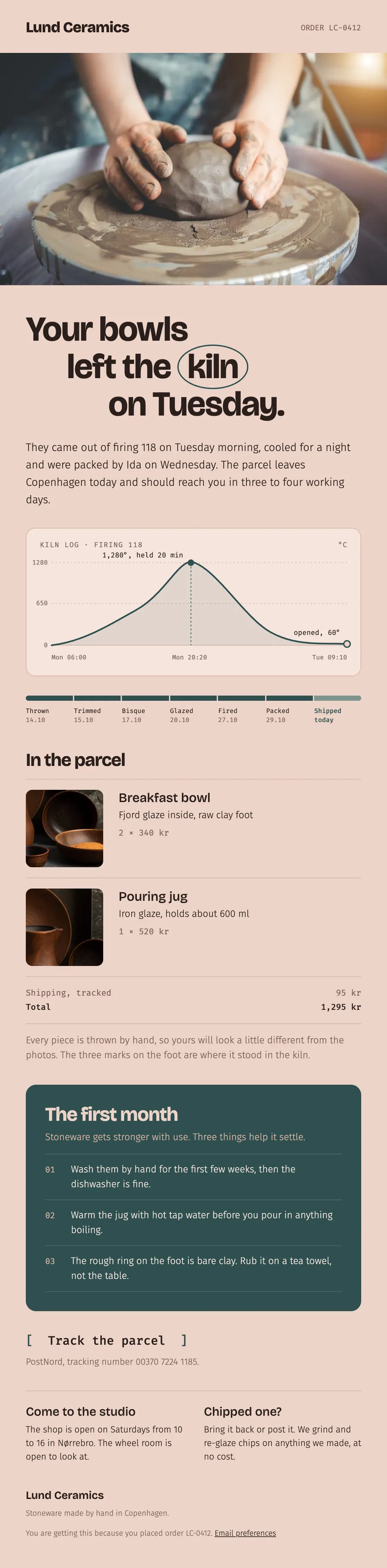
A shipping email for a ceramics studio: the log of the firing, the seven steps from wheel to parcel, and care for the first month.
The brief
Turn the plainest email in the order flow, the shipping notice, into one people keep.
What we designed
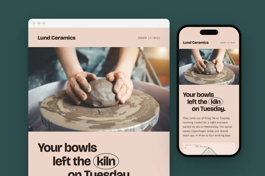
The headline steps down the page with the word kiln circled. A chart of the firing shows the climb to 1,280 degrees and the cooling, then a bar marks the seven stages each piece went through.
The order, a care card in the glaze colour and a bracketed button to track the parcel close it.
How it is built
- The kiln chart is drawn as a 2x image with the whole curve written out in its alt text
- 600 px wide, built in tables with inline styles
- A phone layout that stacks below 600 px
- The brand's fonts, with web safe fallbacks for clients that block them
- Images at twice their size for sharp screens, alt text on every one
- Preheader, preferences and unsubscribe in place
Typefaces: Bricolage Grotesque, Fira Sans, Fira Mono. Palette: Clay #ecd3c8, Glaze #2f4f4f, Slip #d9b5a5, Ink #2a1f1b.