
SERA
Email design, product launch · Milan
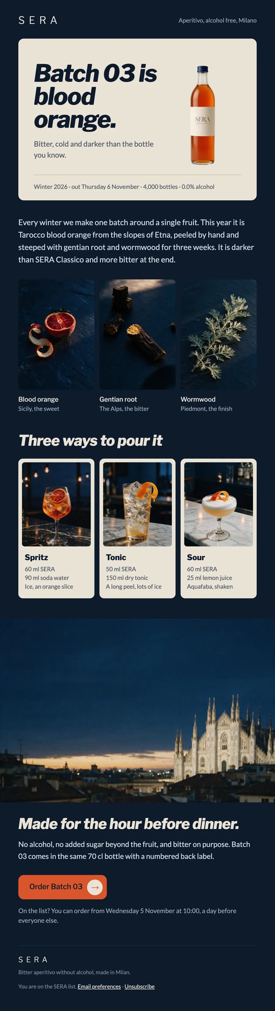
A launch email for a winter batch of alcohol free aperitivo: the bottle, its three botanicals and three ways to pour it.
The brief
Launch one limited batch to the list, with a day of early access for subscribers.
What we designed
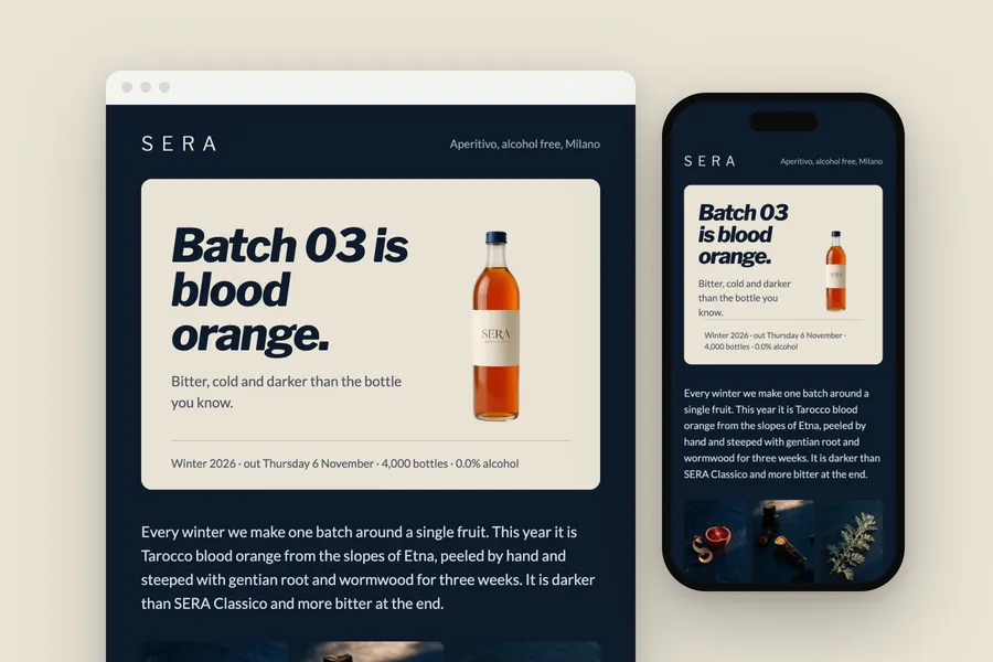
A linen card holds the bottle and the headline on the brand's navy ground. The three botanicals follow as a row of dark still lifes.
Then three recipe cards, the rooftop at aperitivo hour, and the order button with its round arrow.
How it is built
- The recipe cards stack into one column on a phone
- 600 px wide, built in tables with inline styles
- A phone layout that stacks below 600 px
- The brand's fonts, with web safe fallbacks for clients that block them
- Images at twice their size for sharp screens, alt text on every one
- Preheader, preferences and unsubscribe in place
Typefaces: Libre Franklin, Lato. Palette: Dusk #0e1a2b, Linen #e9e3d5, Bitter #d9562b, Amber #e9a648.