
Octavo
Email design, newsletter · Literary quarterly
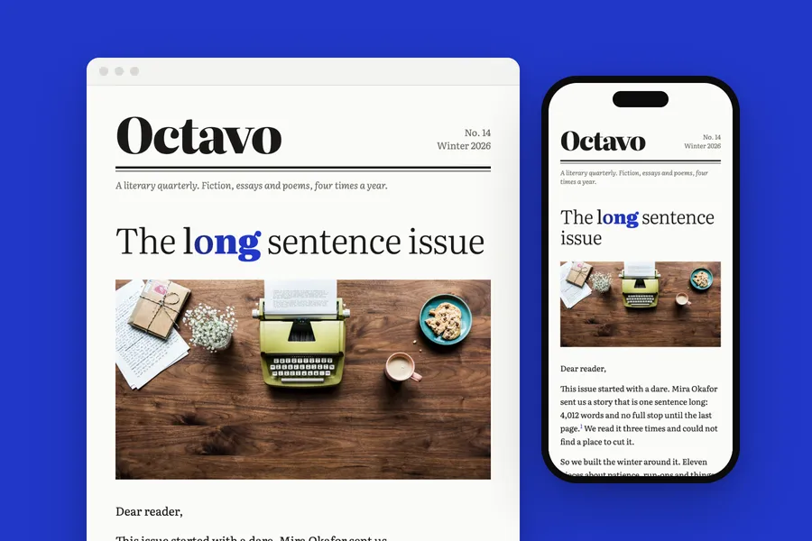
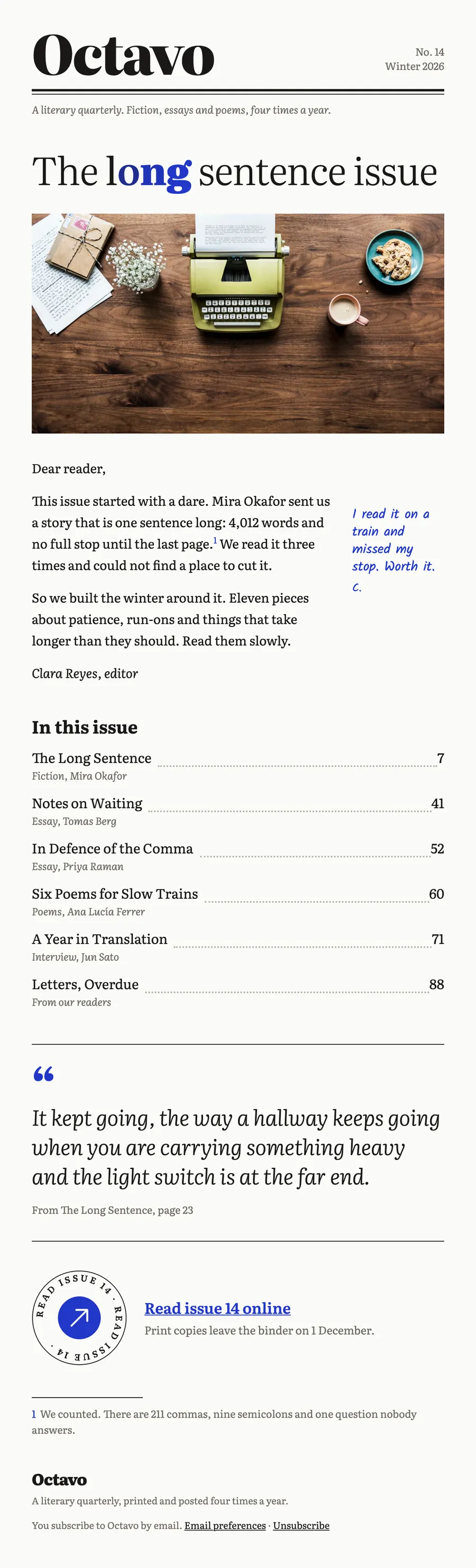
A newsletter for a literary quarterly: a masthead, a contents page with dot leaders, and the editor's note in the margin.
The brief
Send the new issue the way a printed quarterly opens: masthead, letter, contents.
What we designed
The headline thickens letter by letter on the word long, from light to black, and turns cobalt. The editor's letter carries a handwritten note in the margin and a footnote that pays off at the bottom.
The contents run with dot leaders and page numbers, and the button is the quarterly's circular badge.
How it is built
- Five weights of one variable font in the headline, each letter its own weight
- 600 px wide, built in tables with inline styles
- A phone layout that stacks below 600 px
- The brand's fonts, with web safe fallbacks for clients that block them
- Images at twice their size for sharp screens, alt text on every one
- Preheader, preferences and unsubscribe in place
Typefaces: Literata, Kalam. Palette: Paper #fbfbf8, Cobalt #2137c9, Ink #1a1916, Margin #6f6b62.
Next project: Haldane Muir · All work