
Heed
Email design, product emails and newsletter · Global
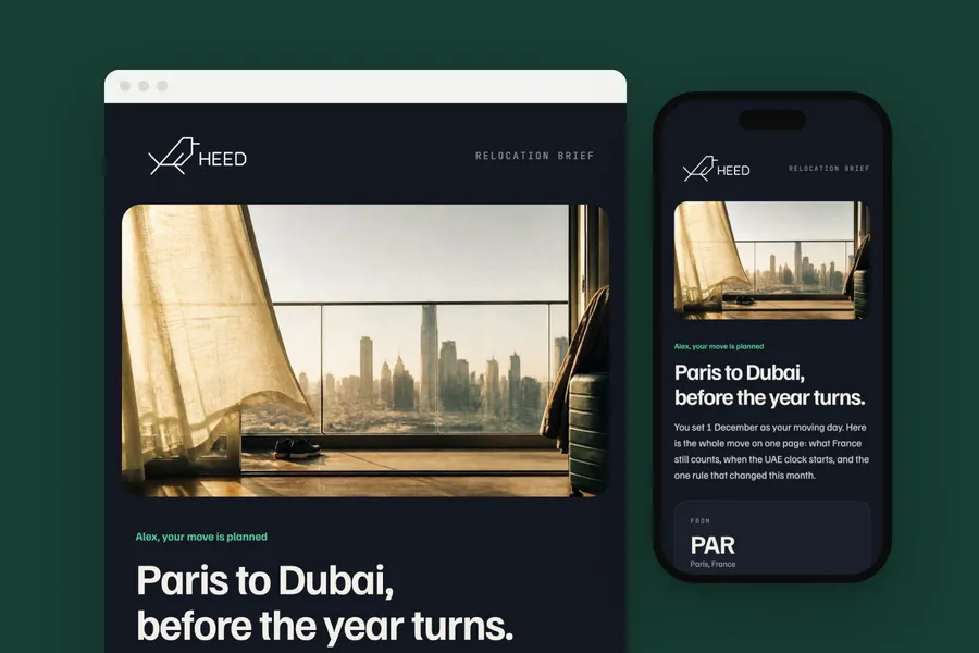
The emails a tax intelligence platform sends, from sign-up to Heed Weekly, led by a relocation brief from Paris to Dubai. The brief puts the route, the dates and the rates on one page.
The brief
Give every email the product sends one look, the dark Heed ground of the app, so an alert reads as part of Heed and not as a system message.
What we designed
Each email sits on the dark ground of Heed's logo tile, in Familjen Grotesk with JetBrains Mono for dates, figures and codes. A change alert opens on the country and the effective date, says what changed in two lines and names the parts of the profile it matched.
The residency and visa warnings put the number that matters in one raised panel: days left before a threshold, or the date to be back by. Sign-up and sign-in stay as short as a button, and Heed Weekly lists the proposals under discussion, each with the date it would take effect.
Three emails are designed for the set on top of the app's own. The relocation brief leads: a boarding pass for the move, the route on Heed's dotted map, France against the UAE rate by rate and the three dates to get right. Then the year so far, every day of 2026 as a square in the colour of the country it was spent in, with each country against the 183-day line; and a lifestyle email in the photography of heed.finance, on the three moments that decide how a year across borders is taxed.
The whole flow
- Confirm sign-up, when someone creates an account:
- Sign-in link, each time someone signs in by email:
- Welcome, once the email is confirmed:
- Change alert, when a verified change matches the profile:
- Weekly digest, every week, the matched changes in one email:
- Your year so far, once a month, from the residency tracker: Your year so far: 289 days, four places
- Residency warning, as the day count nears a threshold:
- Relocation brief, when a move is planned: Paris to Dubai, before the year turns
- Re-entry warning, thirty days before a visa re-entry window closes:
- Heed Weekly, subscribed, when someone joins heed weekly:
- Heed Weekly, every tuesday: Heed Weekly
- Living across borders, a heed weekly feature, now and then: Three moments decide it.
How it is built
- Built as React Email components in the app, rendered for every product send and for the 13 sign-in emails
- Helvetica and Menlo stand in where a mail client loads no web fonts
- 600 px wide, built in tables with inline styles
- A phone layout that stacks below 600 px
- The brand's fonts, with web safe fallbacks for clients that block them
- Images at twice their size for sharp screens, alt text on every one
- Preheader, preferences and unsubscribe in place
Typefaces: Familjen Grotesk, JetBrains Mono. Palette: Ground #131722, Signal green #5fb78a, Ivory #f2f1ec, Forest #173f34.

Case study: Heed case study: the platform and its dashboard
Next project: Thermae 88 · All work