
Sorella
Email design, product launch · Milan
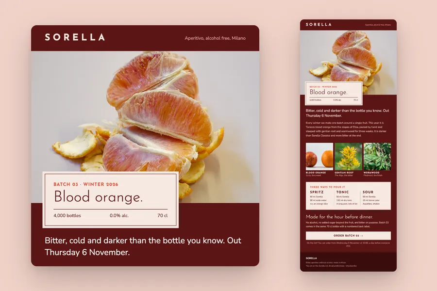
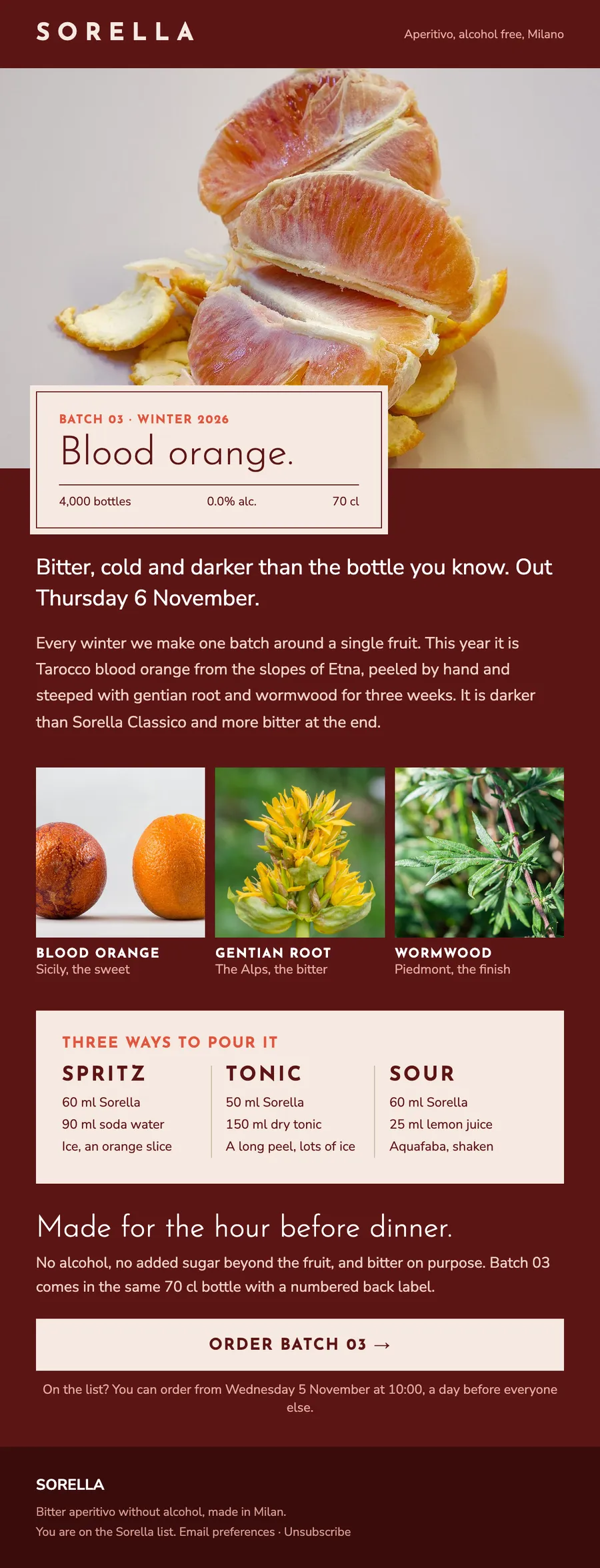
A launch email for a winter batch of alcohol free aperitivo: blood orange from Sicily, its three botanicals and three ways to pour it.
The brief
Launch one limited batch to the list, with a day of early access for subscribers.
What we designed
Peeled blood orange fills the top, with a label card for Batch 03 over it: the name of the fruit, 4,000 bottles, 0.0% and 70 cl.
The story of the batch follows in two short paragraphs, then the three botanicals as photos with where each comes from, three recipes in one card, and the order button with the day subscribers can buy first.
How it is built
- The three recipes sit in one card of live text, readable with images off
- 600 px wide, built in tables with inline styles
- The brand's fonts, with web safe fallbacks for clients that block them
- Images at twice their size for sharp screens, alt text on every one
- Preheader, preferences and unsubscribe in place
Typefaces: Josefin Sans, Nunito Sans. Palette: Blood #5C1515, Rose #F0D2C8, Peel #E0563E, Cream #F6E9E1.
Next project: The Margate Review · All work