
The Margate Review
Email design, newsletter · Margate
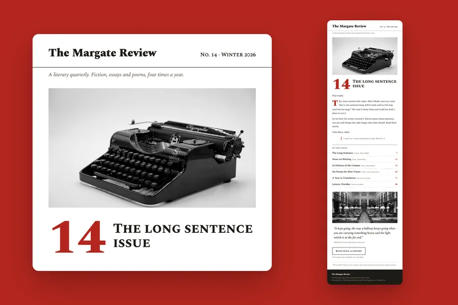
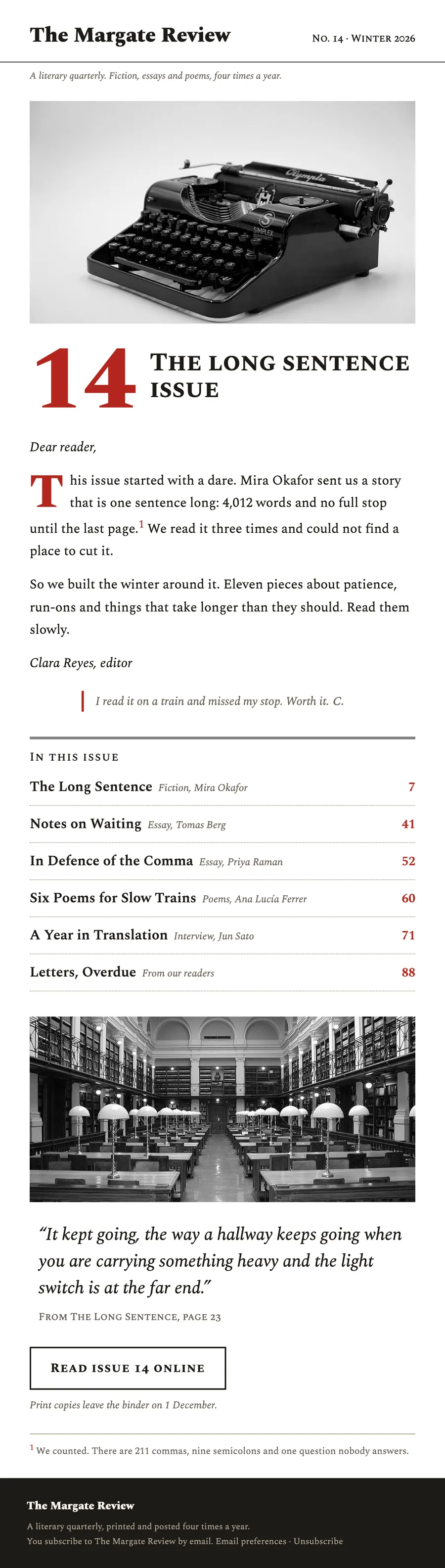
A newsletter for a literary quarterly: the issue number, the editor's letter with a note in the margin, and the contents with page numbers.
The brief
Send the new issue the way a printed quarterly opens: masthead, letter, contents.
What we designed
A masthead with the issue and season, a typewriter in black and white, and the issue number set large in red beside its title.
The editor's letter opens on a red drop cap and carries a footnote that pays off at the bottom, with a reader's note in the margin. The contents run with page numbers, then a line from the lead story and one outlined button.
How it is built
- Spectral and its small caps cut for the masthead, the contents and the button
- 600 px wide, built in tables with inline styles
- The brand's fonts, with web safe fallbacks for clients that block them
- Images at twice their size for sharp screens, alt text on every one
- Preheader, preferences and unsubscribe in place
Typefaces: Spectral, Spectral SC. Palette: Paper #FFFFFF, Red #B3261E, Ink #1D1A16, Margin #6B6358.
Next project: Rennie + Hogg · All work